IIID Conversations is a series of informal events. As the name suggests, they are conversations as much as talks. The speakers make short presentations of their work or ideas, then interview them and the conversation will open out to include everyone.
In 2021 we consulted our members on what they would like to see. Their answer was ‘community’ – most wanted to feel more connected to others in their profession, to gain insight about practice, and to gain new knowledge about the various different types of work information designers do.
IIID Conversations is free for IIID members, and €6 for non-members.

Coming up:
Wolfe Erikson: The Future of Care
23 May 2024, 17:00 UTC
Wolfe will be framing the complexities of what it means to navigate the US medical system as a person with chronic and / or disabling health concerns. This will include a primer into what trauma is and how it impacts the nervous system – and will underscore the core principles of trauma informed design. We’ll also discuss case studies of information design as it is being used within healthcare services and how these interventions can positively or negatively impact patients.
Registration: Eventbrite
Previous conversations
The Community Network Roadmap (CNR) is a guide for people with no prior background in network technologies to build and maintain their own broadband networks. In this presentation, Katherine and Shradda will share an overview of the CNR project, including highlights of the highly interdisciplinary collaboration process, and look at our design decisions in terms of the publication format and structure.
Robert Linsky: The Way Communications Should Be
Robert Linsky talked about the way communications should be – clear, accessible, simple, effective. Organizing, rewriting, and redesigning letters, invoices, statements and other mundane but necessary correspondence.
- Making mundane, boring communications clear
- The importance of clear communications for bills, statements, letters, and notices
- Creating Clear, Accessible, Simple and Effective communications
- Creating a better CX through variable data communications
Saskia van Manen and Claudine Jaenichen: Design for Emergency Managment
This talk discusses the distinctions between this emerging discipline and traditional design, and showcases how design methods bring innovative evidence-based perspectives to the complex challenges presented by natural hazards such as earthquakes, hurricanes, flooding, and wildfires. This role extends far beyond aesthetics, and the discussion will underscore the imperative for collaborative endeavors that encompass a variety of stakeholders and ensure inclusive representation.
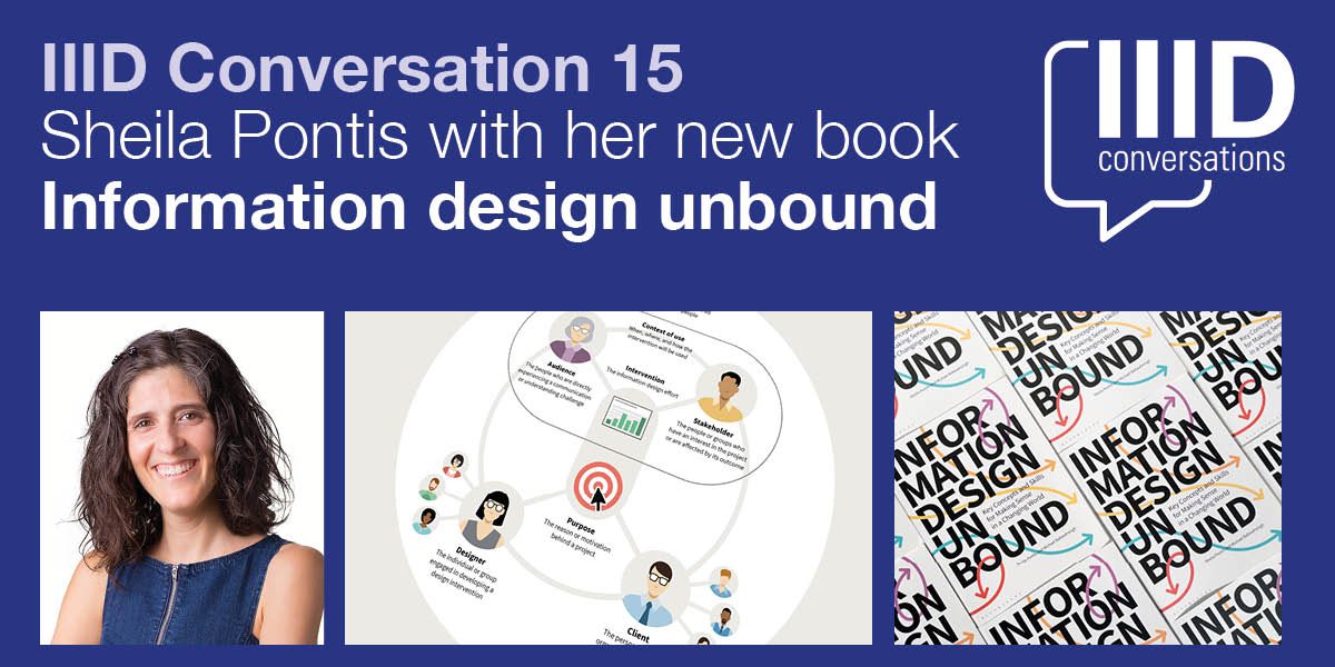
Sheila discusses her new book, Information Design Unbound. It is an important new resource about the theory and practice of information design. It provides a comprehensive introduction to the field. The emphasis is on developing essential strategic thinking and visual problem-solving capabilities.
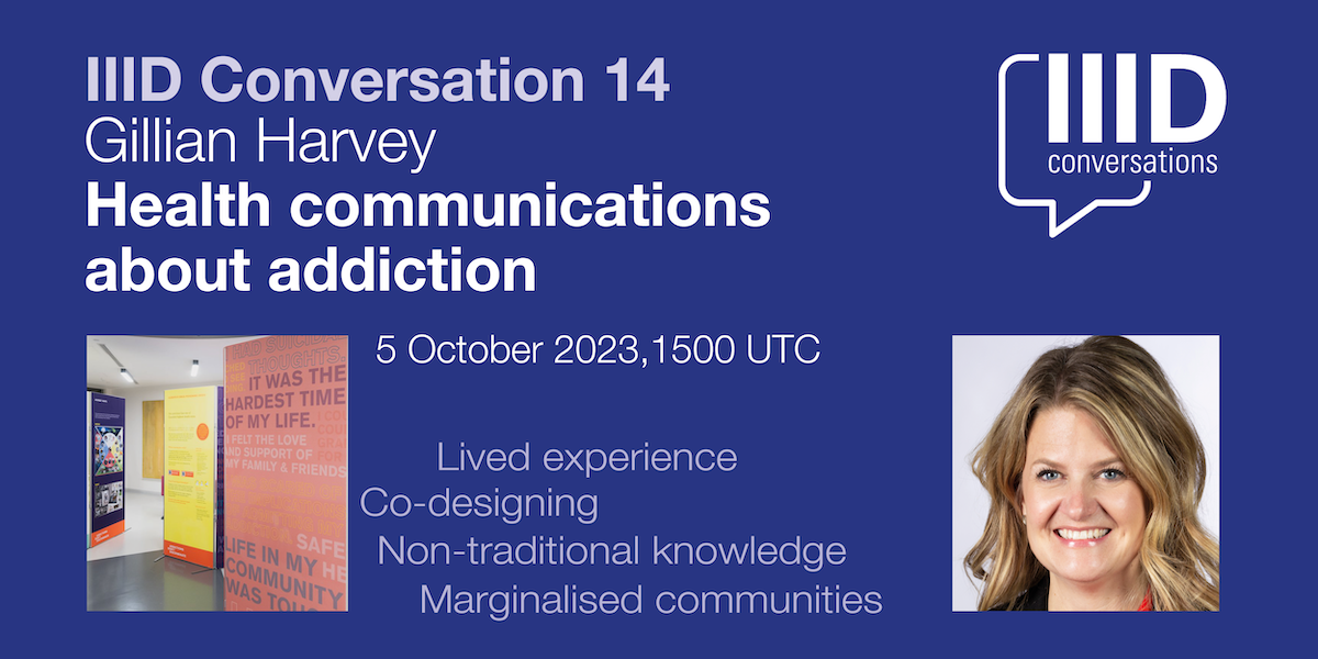
Gillian Harvey: Health communications about addiction
Gillian says “it’s important to engage communities in health system change, particularly for marginalized and equity seeking groups. I will also discuss what types of methods work well, but also what could be improved upon in using co-design”. She discusses two projects designed to increase empathy and reduce stigma toward people who experience addiction using co-design methods to learn from lived experience and non-traditional knowledge forms.
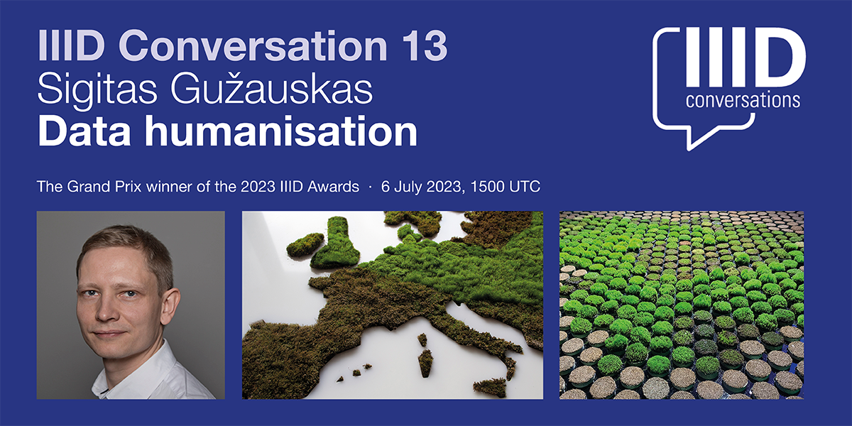
Sigitas Gužauskas: Data humanisation
To enhance clarity, information design often simplifies complex real-world phenomena into basic visual representations. While these graphics are clear, they may not always have the impact needed. By adding an experiential layer to the dry data, designers can aim to captivate a wider audience and offer a broader range of interpretations.
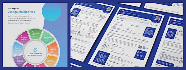
Rui Caminha: Legal Design for Legal Efficiency
Villa is the leading company in Latin America specializing in Visual Law and Legal Design. In this presentation, Rui shares two of the most iconic projects that mark their journey. The first project is the “Easy Contract for TIM,” a mobile telecommunications adhesion contract designed to transform store customer experience. The second project is the “Visual Law and Plain Language Handbook,” created for the Court of Justice of Mato Grosso.
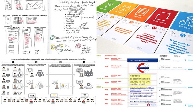
Sheila Pontis: A human-centered research clinic for information designers
Sheila is one of the foremost experts on human-centered research for information design. She introduces her own work, and answers the participants’ questions on how to bring research into practice.

Karel van der Waarde: Medicines information: Are we really enabling patients to take medicines?
Taking medicines is a stressful activity. Opening a cardboard box, reading a leaflet, handling tiny pills, checking the dosage and the time, and considering potential side-effects require the capacities of a strong, astute, and healthy adult. Several of these activities are fairly difficult, especially when our dexterity, eye-sight, and mental flexibility decreases.
Karel van der Waarde shows examples of medical information design in context. He questions their use and provides reasons from both industry and regulations why these situations change so slowly.
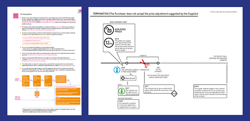
Stefania Passera: Legal Information Design: Towards user-friendly contracts
“I have read and understood the terms and conditions” is the biggest lie on the internet – no one reads, and definitely no one understands (except the lawyers).
When most of us hear “contracts”, we think of impenetrable walls of legalese envisioned to protect a party at the expense of the other. But there’s another way. Through information design, contracts can be transformed into tools that work better for business, for people, and ultimately for society.
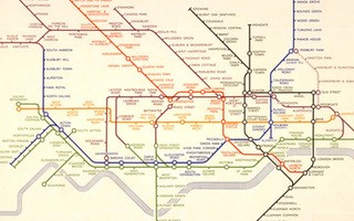
Maxwell Roberts: Why Henry Beck’s 1933 London tube map design was such a resounding success
It’s exactly 90 years since the launch of Henry Beck’s 1933 London Underground network diagram, which has become an iconic example of information design.
Maxwell Roberts is the pre-eminent expert on the diagram and author of several books on it. He says: “It was a remarkable work of elegant compromise, effortlessly balancing conflicting priorities and presenting passengers with a design that simplified reality in a useful way. In this talk I will highlight these priorities and consider recent findings in usability testing that show the importance of attending to them.”
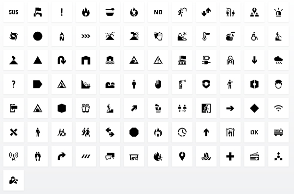
Rodrigo Ramírez: Visual Tools – Information design as a way to manage crises and emergencies
Rodrigo talks about the Guemil icons project, with testing through participatory workshops in communities.

Rupesh Vyas: Eliciting public participation through information design
Public participation is crucial in the present-day context of increasingly complex scenarios of data-driven approaches in various domains. Rupesh discusses the challenges and exploration of information design approaches through case examples from his teaching and practice-based design research projects at Aalto University.

Carlos Rosa: Moving Pictograms
The introduction of motion is an important contribution to facilitate the interpretation of pictograms and to enable them to develop in other ways, for example, to encourage civic behaviour, enhance the content of a message and to create emotional ties.
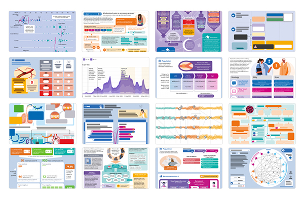
Will Stahl-Timmins: A picture of health: Visualising medical information for doctors
At The BMJ (British Medical Journal) we use infographics and data visualisations to convey the information we publish to busy health professionals in an efficient and engaging way. In my talk I introduce the kinds of graphics we make, including full page “visual summaries”, interactive graphics, and visual abstracts.
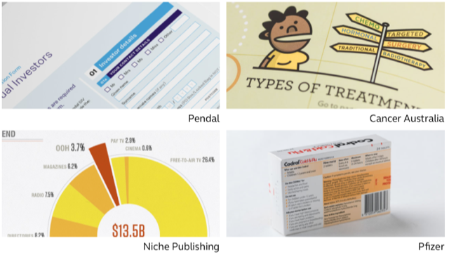
Alex Tyers: Information design for financial communications
Alex talks about information design for financial communications. He says “Most people I talk to express surprise that a bank statement, form or insurance letter is even designed at all, maybe because they are often so bad. However, I can confirm that – yes – financial communication design is a thing. I will be discussing how financial comms can be improved, and what can hold this back. I will be showing examples from projects I have worked on for financial organisations and highlighting some of the things I have learned.”
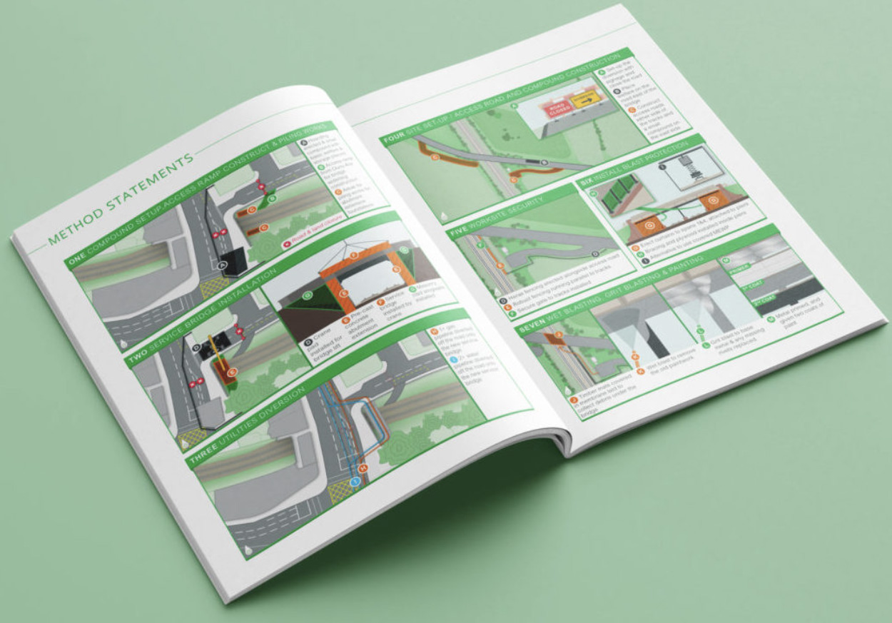
Oliver Tomlinson: The hidden graphics
Oliver reflects on his experience of creating diagrams for large corporate bids and tenders. He discusses how business ‘authors’ work with his team of information designers, creating diagrams to work alongside text in a hidden world of huge commercial contracts.
